Digital ecosystem for the app supermigration
Itaú / EBAC
I proposed guidance to help customers find familiar functions and track their move to a new banking app.
Mirror Mode: find and complete a task.
Project screens presented in sequence, not a recording of the prototype.
I distributed eight needs across four proposed products and defined what customers could do on mobile, web and watch before designing the screens.
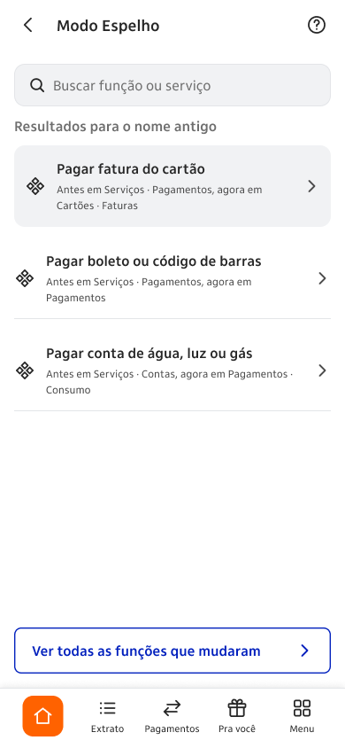 Function translator
The case at a glance
- The problem
- When functions moved to a new app, customers had to find them again and follow support across separate channels.
- My role
- UX & UI Designer
- The decision
- I distributed eight needs across four proposed products and defined what customers could do on mobile, web and watch before designing the screens.
- What I observed
- Four real participants and one simulated session produced 19 prioritised findings across two tasks.
- Why it matters to the business
- I wanted customers to find their usual tasks and understand what had changed. Whether this would reduce support requests or abandonment remains untested.
- What was not measured
- This academic project was not launched. The sessions identified issues to revise; they did not measure a failure rate or business results.
Deliverables and methods
An academic ecosystem proposal with 104 tokens, 27 components and a prioritised validation backlog.
I reviewed public material, mapped the channels and tested prototypes. The sessions helped me find inconsistencies before applying the visual identity.
Helping customers navigate the app migration.
In this individual EBAC academic project, I explored how a banking app migration can preserve familiar routines and communicate changes clearly.
Read more
Delivered and defended in 2026, with no production implementation. Four proposed products cover mobile, internet banking and watch, with each channel assigned a specific role.
Where did the function I used every day go?
I looked at three situations that could leave customers unsure: a function moving, an unexplained charge and a support queue with no updates.
Read more
I needed to place guidance alongside the tasks customers already used, rather than ask them to find another support entry point.
I combined public complaints with four customer accounts.
Documentary research examined public complaints. An asynchronous questionnaire gathered four recurring customers’ accounts of functional continuity.
Read more
All four respondents described functional continuity. The transparency persona was based only on public material; I had not yet researched that profile directly.
I assigned each of eight needs to a product.
I mapped each need to a responsible product: Mirror Mode, Change Radar, Transition Panel and Unified Timeline. The channel matrix was set before drawing screens.
Read more
Generic visual redesign and expanded cashback were rejected because they did not address the documented needs. Existing task entry points lead into the shared ecosystem.
Existing task → Shared hub → Contextual support
A proposed ecosystem that connects four products across three channels.
The timeline contradicted the case title.
Five sessions across two tasks produced 19 prioritised findings. Four participants were reinvited; the fifth session was simulated from the documentary persona.
Read more
A case-closure title contradicted an in-progress timeline on the same screen. This was corrected before applying the visual identity. Findings are not a statistical failure rate.
A shared foundation for mobile, web and watch.
The proposal includes 12 product-channel deliverables, 104 tokens in three layers and 27 components. Accessibility informed touch targets and colour decisions from the foundation.
Read more
The case documents WCAG 2.2 checks and 44 × 44 touch targets. The screen sequence below presents the supplied prototype screens; it is not a recording of a launched banking feature.
SuperApp: homepage versions
Academic prototype screens in Portuguese. The bank did not launch this project.
Web: case follow-up and closure
Academic prototype screens in Portuguese. The bank did not launch this project.
Watch: short alerts and status
Academic prototype screens in Portuguese. The bank did not launch this project.
Mirror Mode: find and complete a task.
Project screens presented in sequence, not a recording of the prototype.
I distributed eight needs across four proposed products and defined what customers could do on mobile, web and watch before designing the screens.
Function translatorInstability and Rescue Mode.
Project screens presented in sequence, not a recording of the prototype.
I distributed eight needs across four proposed products and defined what customers could do on mobile, web and watch before designing the screens.
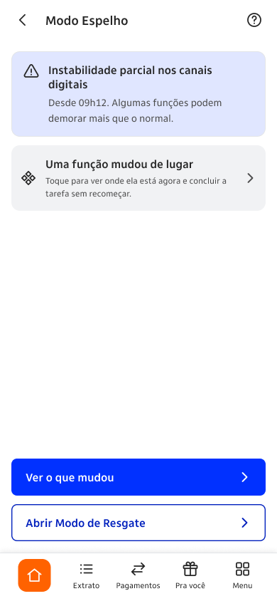 Partial instability
Change Radar: prepare for a moved function.
Project screens presented in sequence, not a recording of the prototype.
I distributed eight needs across four proposed products and defined what customers could do on mobile, web and watch before designing the screens.
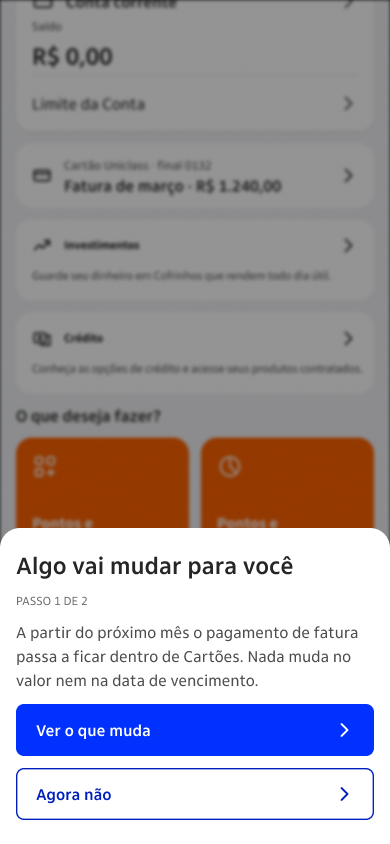 Change notice · Step 1
Change Radar: understand and dispute a charge.
Project screens presented in sequence, not a recording of the prototype.
I distributed eight needs across four proposed products and defined what customers could do on mobile, web and watch before designing the screens.
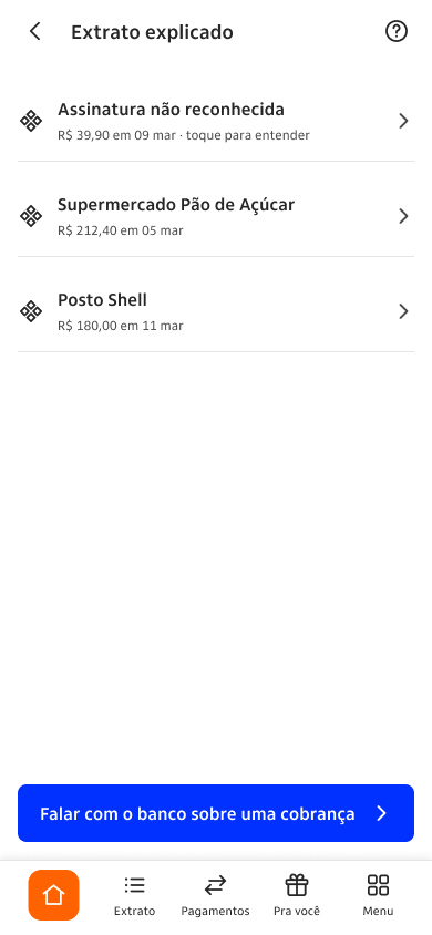 Explained statement
Transition Panel: follow migration status.
Project screens presented in sequence, not a recording of the prototype.
I distributed eight needs across four proposed products and defined what customers could do on mobile, web and watch before designing the screens.
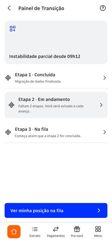 Transition status
Unified Timeline: consult the latest case.
Project screens presented in sequence, not a recording of the prototype.
I distributed eight needs across four proposed products and defined what customers could do on mobile, web and watch before designing the screens.
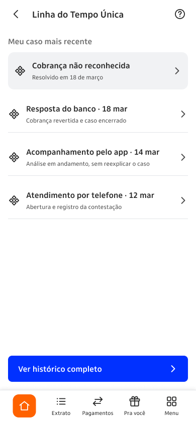 Quick case timeline
View the complete screen gallery
What I would revise and test next.
I presented the academic proposal with a prioritised list of issues to revisit. It was not implemented in the bank, so I could not assess a real migration.
- Observed in validation
- Four real participants and one simulated session produced 19 prioritised findings across two tasks.
- What this could mean for the business
- I wanted customers to find their usual tasks and understand what had changed. Whether this would reduce support requests or abandonment remains untested.
- What I would measure next
- I would recruit real participants for the transparency-and-trust profile, revise the prioritised issues and retest the tasks and understanding of migration status.
Read more
I would start by researching the transparency-and-trust profile directly. The project showed me how important it is to decide what happens when a customer moves between channels.